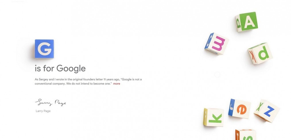
Google grows out of a Letter to the Alphabet
Google has reorganized itself into multiple companies, separating its core Internet business from several of its most ambitious projects while continuing to run all of these operations under a new umbrella company called Alphabet.
“What is Alphabet? Alphabet is mostly a collection of companies. The largest of which, of course, is Google,” Google co-founder Larry Page said in a blog post this afternoon. “This newer Google is a bit slimmed down, with the companies that are pretty far afield of our main Internet products contained in Alphabet instead.”
“Google is not a conventional company. We do not intend to become one.”
– Larry Page
“Our company is operating well today, but we think we can make it cleaner and more accountable. So we are creating a new company, called Alphabet. I am really excited to be running Alphabet as CEO with help from my capable partner, Sergey, as President.”
The announcement was greeted by some industry experts with enthusiasm and others a bit skeptical. Below is the extract from some of them.
Devindra Haradwar, Engadget:
In trying to avoid the mistakes of many big tech companies, Google has crafted itself an unconventional future. But it will be years before we see if Google’s Alphabet pays off.
Natasha Jen, Pentagram partner:
It’s playful in a completely different (and much more subtle) way! Look at the shape of the counter in the lowercase “a”: It’s like a water-drop! If they have a whole typeface that goes with it, it can be a great typographic system and they can really play with it.
Here’s my speculation: Their (Larry and Sergey) design sensibility may have just matured with them (as executives and founders running one of the biggest enterprises on planet). They have worked design over many years into everything, from product to interface to architecture to the business. Their understanding about design may have been very different—a lot more sophisticated, may I say—from the early days. Look at Google’s Material Design. That’s radically simplified and nuanced from the original Google identity design. There’s an elegance in it that comes with maturity. And I see that elegance in the Alphabet logo.
Steven Heller, design critic and author:
For much of the digital age (to date), media and data companies have been giving themselves adolescent names, like Twitter, Firefox, Instagram. Its been like the Our Gang kids said, “Let’s make a company.” With this new branding the age is moving from adolescence into young adulthood. Its not as corporate as IBM or Westinghouse, but it is simple and to the point. Its also not as obscurantist as Verizon or Altria. It is a name so obvious and unthreatening that it personalizes the growing giant. The logo is similarly simple and accessible. Upper and lower case is nice and friendly and the “a” in particular is a nice subtle nuance.
Howard Belk, chief creative officer of Siegel+Gale:
There is a sort of joy to these guys that comes through in how they innovate. They’re saying, “we are unapologetic innovators, we have to be in this tech space. We respect and understand our investors, and want to make clear where money is going.” That’s what’s driving the reorganization. So when it comes to the new identity system there’s a logic. You’ve got the alphabet, but there’s these children’s blocks. It gives a lot of ability, as Paul Rand would say, to play with design.
Tobias Frere-Jones, typographer:
I keep getting drawn back to this lowercase “a”, which lacks the subtlety of the other forms, like it missed a week of letterform school. Strokes that completely enclose a small white space (like the “a” and “e”) need to be thinned out a bit so they don’t appear to be heavier. But it doesn’t look like that allowance was made, so the bottom curve of the “a” looks too heavy, and becomes another distraction. The simple calmness turns fussy and fidgety right in the middle of the word. The three curves fight one another, and the stroke aperture at the top is sure to collapse (literally or seemingly) at smaller sizes. I hope they also made small-size versions which treat this feature more practically. On the whole, I think it’s a well-made mark that could have borne some more polishing.
Steven Levy, Medium:
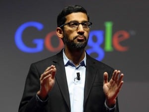
The sense I get at Google is that this new structure is but an evolution of a process begun when Page stepped back from everyday operations last October and turned over much of Google’s product functions to his key lieutenant Sundar Pichai (who now becomes the CEO of Google lite). But Google…er, Alphabet, has seemingly crossed a line by structuring its divisions as separate companies in the Berkshire Hathaway model. At this point, neither Page or anyone else has indicated how thick that line is.
In another exciting announcement, Page announced Sundar Pichai, Google’s Product czar, to be crowned as new CEO for Google.
Source: Engadget, Wired, CNet, Medium, Google.